Discovery, research, and the design of a digital stamp catalogue and collection tool
Role
Sole product designer
Scope
Discovery, research, design, user testing
While working for a heritage collectibles business, I led the design of a new digital stamp catalogue and collection platform. At the time, the business already had a long-standing catalogue and collection tool, but it had been built by a third party and left largely unmaintained, meaning the data was outdated. It also relied on a simplified dataset that did not reflect how serious philatelists collect. As a result, the company set out to build a modern platform with a comprehensive dataset, enabling collectors to explore in greater depth, search effectively, and keep a digital record of the stamps they owned and wanted.
I was the sole product designer on the platform from discovery through to a beta release which was tested with around 75 users. I led discovery and owned the end-to-end design of the platform and its design system, working alongside a senior product manager, a delivery manager, and six developers. During the research phase, I was supported by a senior product design contractor who assisted with survey design and proposition testing.

Re-created screens using fictional stamp data.
Why the existing data wasn't enough
The stamp catalogues published by the company come in two distinct levels of detail depending on the publication. Simplified catalogues typically list only one version of each stamp design, even when the same design has been reused or printed in different shades of the same colour, and exclude varieties such as watermarks and paper types. They also provide pricing for a two collecting conditions. In contrast, comprehensive catalogues include all recognised varieties and can provide pricing across up to four different conditions.
Taking the world's first postage stamp, the Penny Black, as an example, the simplified listing includes just a single black stamp. In practice, however, collectors recognise three distinct shades: intense black, black, and grey-black, all of which are represented in the comprehensive catalogue. Collectors also distinguish between other varieties, such as stamps with inverted watermarks or those printed on different paper types. While these differences may appear subtle, they are important to high-value collectors because they can have a significant impact on a stamp's rarity and value.
The legacy tool relied exclusively on the simplified dataset, meaning it could not meet the needs of more serious collectors. This limitation was repeatedly highlighted in customer feedback from users who cancelled their free trials. Supporting the comprehensive catalogue therefore became a core requirement for the new platform.

Simplified vs comprehensive comparison for the Penny Black.
Discovery: interviews
The initial research for this project began with a discovery phase involving interviews with stamp, coin, and trading card collectors and dealers. Although the company is best known for dealing in stamps, it also cateres to other collecting markets, and so the goal of the research was to identify opportunities across these three different verticals.
The interviews explored the end-to-end collecting journey to understand how collectors discover, acquire, manage, and value their collections which revealed recurring pain points during the following activities:
Discovering items worth collecting
Finding and purchasing specific items
Grading and authenticating items
Researching historical sales and auction prices
Keeping a digital record of a collection
Discovery: validating at scale
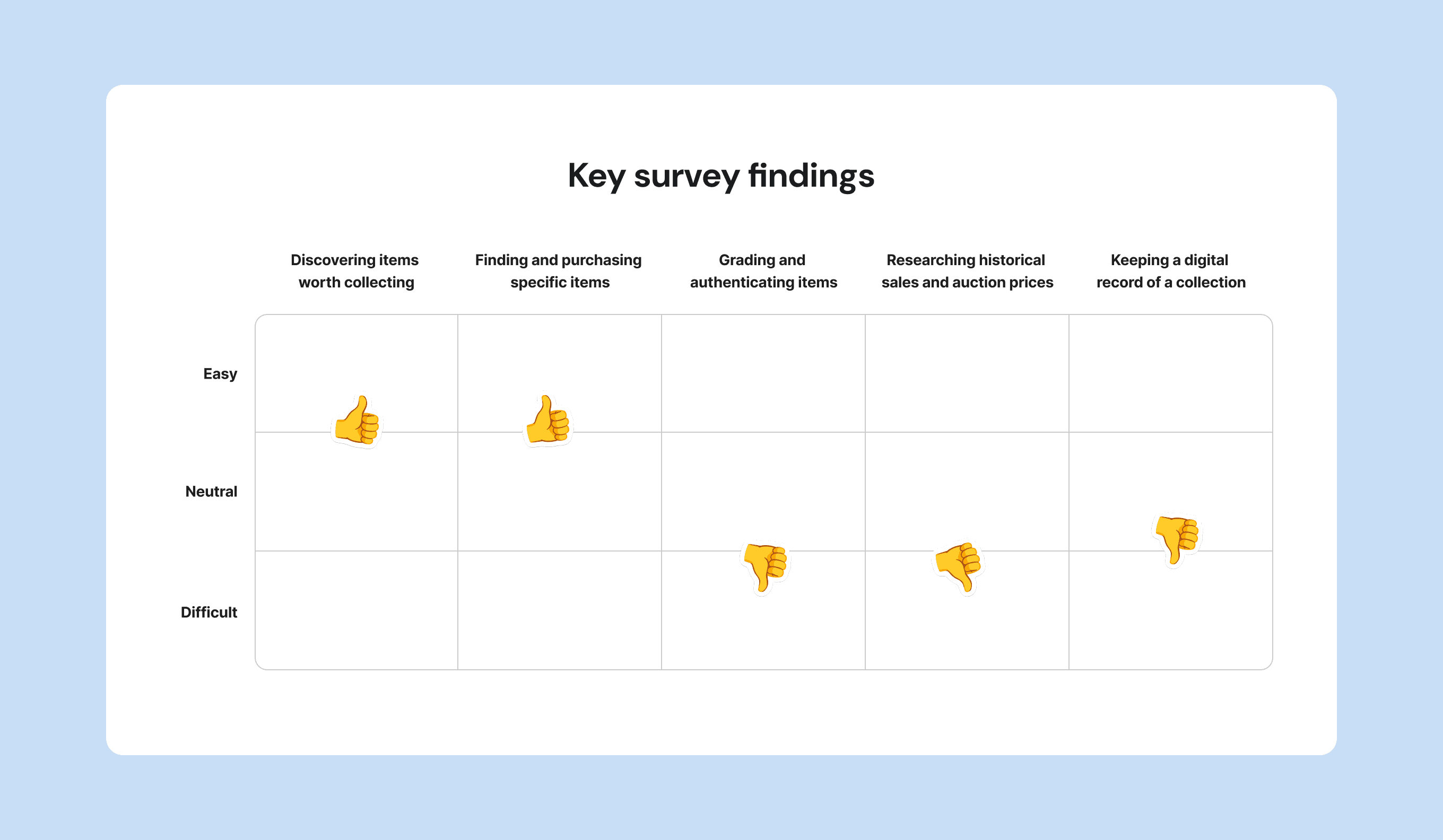
To find out how widespread these pain points were, I ran a survey of 900+ collectors across stamps, coins, and trading cards, working with a senior product design contractor on the survey design and analysis. The survey included a mix of Likert-scale questions and opportunities for free-text comments, which were analysed using thematic analysis, giving us further insight into collectors' pain points. The key findings of the survey were:
Discovering items is difficult for high-value collectors
Finding items is a challenge for older collectors and high-value collectors
Most collectors find grading and authenticating slow or difficult
Finding historical sale and auction prices is difficult for nearly everyone
Over half of stamp collectors find it hard to keep track of their collection digitally, and high-value collectors are the most likely to keep a digital record
The problems collectors struggled with most were grading and authenticating, finding historical sale and auction data, and keeping a digital collection.
From research to a focused MVP
The research gave us a list of real problems, but we needed to validate the appeal of possible solutions. To give us more clarity, I ran proposition testing of ten possible directions, again with the contractor's support on the test design and execution. The propositions ranged from a digital catalogue to community features and stamp image recognition. We presented collectors with ten proposition cards and asked them to rate their interest in each. The clear front-runners were:
Digital catalogue, 4.3/5 average interest
Digital collection, 3.3/5
Historical sale and auction data, 3.1/5
Other propositions included: community features, collecting news, grading services, tools to aid discovery, an image recognition app, market availability and grading with slabbing.
Following the proposition testing, we scoped the MVP as a digital catalogue with collection features built in, with the other validated ideas, such as historical data planned as later additions. This kept the first release focused on delivering essential functionality while reducing development complexity and enabling faster validation with real users before we invested in more advanced features.

Winning proposition cards tested with collectors
The core design challenge: the set
Going into the design of the platform, I knew the most important component to get right would be the set. In stamp collecting, a set is a group of related stamps issued together as part of the same series. This is true from the first issue containing the Penny Black and Two Penny Blue through to modern commemorative releases from postal authorities such as Royal Mail. Because catalogues are organised around these sets, they became the foundation of the interface and reappear throughout the platform in explore, search, and across users' collections.
The legacy platform presented sets using a traditional table layout, reflecting the structure of printed catalogues. The heading contained information such as the year of issue and shared attributes of the entire set, while each stamp appeared as a row with a catalogue number, design type, description, pricing columns (for each condition) and controls to add the stamp to your wants list or collection.
Although this structure appears straightforward, the underlying data is far from uniform. Within a single set, stamps may only exist in certain conditions, meaning that while in some sets there may be up to four pricing columns, as few as one could display a value. The existing table structure also came with inherent design challenges for smaller screens, particularly with the new platform introducing up to two additional stamp conditions.
The challenge was to design a component that could accurately represent this irregular data while remaining responsive across different screen sizes and without making missing information appear to be errors. Since almost every part of the platform reuses the set component in different contexts, solving this problem became the foundation for the rest of the interface.
The grid-to-list pivot
The first direction came from a clear opportunity. Print catalogues show very few images, because page count is expensive, so they include only a few designs to represent sometimes large numbers of stamps. A digital catalogue has no such constraint, so the plan was an image-led grid view with the goal of displaying a reference image of every stamp.
For our initial build, we focused on a smaller sub-section of our dataset, based on our most popular catalogue, which featured the stamps of Great Britain. Here we were able to easily provide images for most stamps, a change that was received well by users. However, when we came to add in Commonwealth data, the images were much harder to come by and we had far less as a starting point. This led to a grid full of placeholder images for stamps we had no images for.

Image-led grid view, Great Britain vs Commonwealth comparison. Showcasing the placeholder image problem. Re-created screens using fictional stamp data.
Rather than continuing down this path, I prototyped a list-based alternative, which I tested with users. They consistently preferred the list view, for reasons beyond the placeholder image problem:
Missing conditions could be hidden entirely rather than using empty placeholders.
It made room for more intricate controls, like adding quantities, which had previously sat behind clicking through the grid tiles to the stamp page.
It allowed space for the stamp entries and users' custom data to be added at this level, enabling easier access and displaying them in the context of the set, which suited more serious collectors.

List view, with added flexibility for hiding missing data, more intricate controls and stamp entries shown in context. Re-created screens using fictional stamp data.
In this case, a practical constraint pushed me to test an alternative, and user testing then showed the alternative was better for several reasons I hadn't fully anticipated. It allowed for irregular data to be displayed more gracefully, brought the users custom entries to the forefront, and left room for more intricate controls.
One component, many contexts
Because the set is reused across the platform, designing it well meant designing for every state it appears in. The same core component had to work when browsing the catalogue in explore, when filtering results in search, and when displaying the user’s collection in my stamps, my wants and my albums. In each case, the set needed to behave slightly differently while remaining intuitive throughout.

The set shown in it's four different states in Search/Explore, My Stamps, My Wants and My Albums. Re-created screens using fictional stamp data.
Alongside the set, I designed the surrounding pages: an explore page where users drill down by country, a search page with filters across the whole database, and the collection pages for managing owned stamps, wants, and albums, including adding items into each.
Design system
Since I was the sole designer, I also built the platform's design system, using and altering components from the Chakra UI library as needed. This kept the interface consistent across the platform and made handoff to the six developers a straightforward experience amongst the complexity of the build.
Product management duties
During this process, I was also given the opportunity to support the senior product manager with requirements, liaising with stakeholders, writing tickets, and running design/development sessions to check feasibility, all of which contributed to boosting team productivity.
Where it reached
The platform was designed through to a beta which was tested with around 75 users ahead of launch. The grid-to-list decision came directly out of testing during build, an example of the design changing in response to what users told us rather than being fixed up front.
Reflection
This project taught me that getting one core component right can matter more than designing dozens of screens. Because the set is reused everywhere, all the time spent making it handle the messy, irregular reality of stamp data paid off across the whole product. It also taught me to hold plans loosely: the image-led grid was a perfectly reasonable idea that the data didn’t support at a certain point, and the better answer only appeared because a constraint forced me to test an alternative. Starting from comprehensive data and real collector behaviour, rather than from the simplified catalogue that came before, was what made the tool genuinely useful to the collectors who needed it most.